When I signed on to do the illustrations for The Perfect Ride back in 2023, this was definitely not the painting setup that I envisioned I’d be using.
Still, as strange as it might sound, discovering a new way of working has been both challenging and exciting. In adapting to working on my back, I have freed myself of one of the major constraints of my disabled body—that of fatigue and back pain when I sit up to paint for more than an hour or so a day.
Digital painting is a different beast than acrylic painting. There are things that I like about it such as being able to work in layers and undo mistakes. There are also elements I’m not a fan of such as how digital work can often look flat and too perfect.
When I’ve done digital work in Adobe Photoshop, I have often strived to add texture wherever possible. I’ve done this with my choice of brushes or even adding bits of photos as textured elements. As an example, in this old Little Red Riding Hood piece I used a rough paint texture on the trees and a detail photo of real grass to enhance the grass in the foreground.
Fresco is Adobe’s answer for folks like me who want to put more analog elements into their digital paintings. I had experimented a bit with it in the hospital, but my poor little iPad Mini sputtered and wheezed at its hefty computing requirements. One of my goals in purchasing an iPad Pro last month for my new and improved in-bed workstation was to get Fresco running more smoothly.
Over the past couple weeks, I’ve been quite deliberately putting Fresco through its paces with some interesting results.
I’ve learned over the years that it is a terrible idea to try to learn a new medium or software by jumping straight into creating original work. I need to give myself the space to be in learning mode so that I can discover in advance all the things that are likely to trip me up later.
I began with this fish inspired by my discovery of the work of Victoria Pfeiffer on Bluesky. She does these absolutely beautiful portraits of tropical fish in watercolour and coloured pencil. I love that she fully embraces her passion for fish and it sparked my memories of the Siamese fighting fish I used to keep when I was living in dorms at university.
I took a stock photo that I found and began by tracing the outlines with a fairly standard digital brush. Even this proved more challenging than I anticipated because the brush kept spontaneously picking up random colours off the photo and changing the colour I was painting with.
Remember what I said about trip points?
This is exactly the kind of thing that I would be tearing my hair out over if it wasn’t for the fact that I knew from the start that this was simply a low-risk practice exercise.
Turns out that there was a setting within my new Apple Pencil Pro that turned on the colour picker if the heel of my hand was pressed on the iPad for too long. A quick Google search to find the setting to turn it off and I was back in business.
Working with Fresco’s dynamic watercolour brushes was a fascinating exercise in balancing control versus complete lack of control. The brushes emulate real watercolours in that you can “reactivate” the colour after it’s been digitally painted, creating liquid swishes and mixes. Some of these became too blended, so I began experimenting with multiple layers to better control what was being blended and by how much.
The other particularly fun thing I discovered was that Fresco records a time-lapse of the entire painting process from start to finish. You can see how it unfolded on this reel I posted to Instagram.
By the time I finished my fish, I had decided that this was not the direction I wanted to go with “The Perfect Ride.” I wanted more of the grittier canvas texture that I got with acrylic painting with some of that Impressionist flare to it.
My next practice piece involved a black and white stock photo of ballet slippers that I colourized with a Fresco brush called Cezanne.
For this piece, I deliberately mimicked how I would approach one of my acrylic paintings starting with deep indigo shadows and finessing with golden highlights. This piece felt a lot closer to what I was going for, although, in hindsight, I wasn’t sure I liked the black line work. It might be suitable for the characters in the book, but it was going to look cluttered if I had that look on the background elements as well.
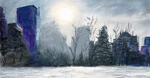
I continued my practice progression by painting a snowy scene based on a photo that Stefan had taken earlier this winter. I wanted to see how my new digital painting techniques might come together on subject matter that was fairly close to what I would be creating for the picture book.
Again, I traced directly over the photo so that I could focus on building my reflexes with the tools themselves. I discovered that I could create a mixture of soft blends and scratchier marks by using the smudge tool intermittently. I would paint and smudge the base layer, then add texture by painting layers of different colours over it.
Overall, I like how this came together. It has that textured, hand-crafted feel that I want to convey in my digital work, and I’m feeling much more confident about diving into all the final art for “The Perfect Ride” that is to come.
And just in time too as feedback notes on my rough sketches just came back from Owl Kids last Friday. Stay tuned!
Came for the stunning fish. Stayed for the super interesting read.
That is a pretty sweet set up. I am glad you are able to pivot and work in different ways. So creative! I am looking forward to the book!